Select Page
Posted by admin | Sep 12, 2024 | Clothes, Polo | 0 |
Posted by admin | Sep 12, 2024 | Clothes, T-shirt | 0 |
by admin | Sep 12, 2024 | T-shirt | 0 |
by admin | Sep 12, 2024 | Clothes, T-shirt | 0 |
by admin | Sep 12, 2024 | Clothes, Trailer | 0 |
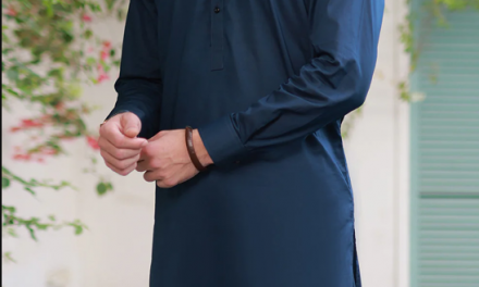
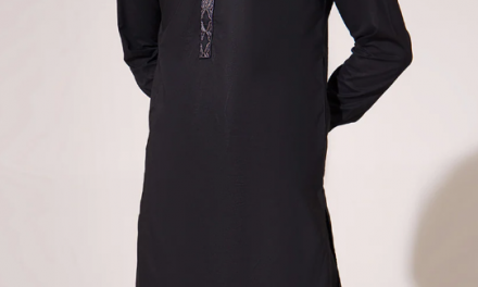
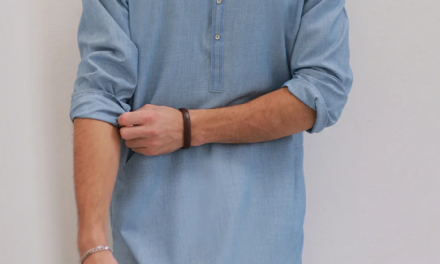
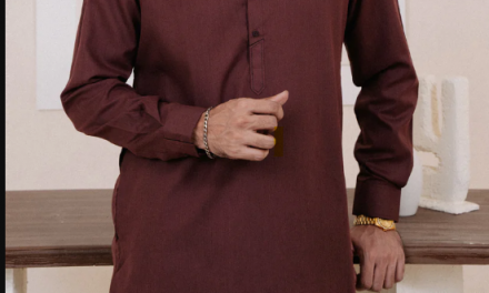
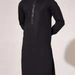
by admin | Sep 12, 2024 | Clothes, Shalwar Kameez | 0 |
by admin | Sep 12, 2024 | Clothes, Polo | 0 |


